Explore my portfolio

Snowflake Native App

Overview

Summary

Role: Product Designer
Team: Product Owner, Frontend Engineer (3 Amigos setup)
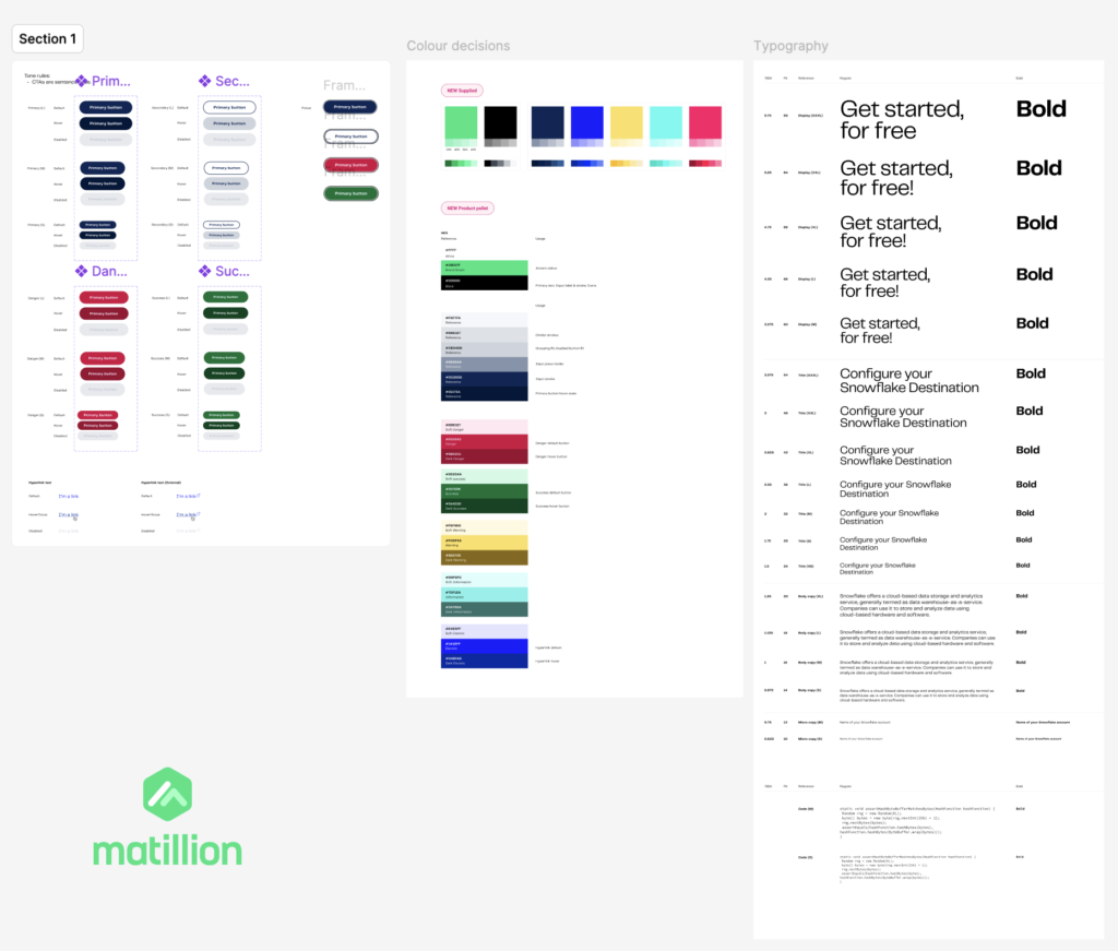
Tools: Figma, Streamlit, Snowflake, Miro
Deliverables: Pipelines dashboard design, create-pipeline form, single-page app architecture
Focus: Interface design within technical limitations (Streamlit on Snowflake Marketplace)

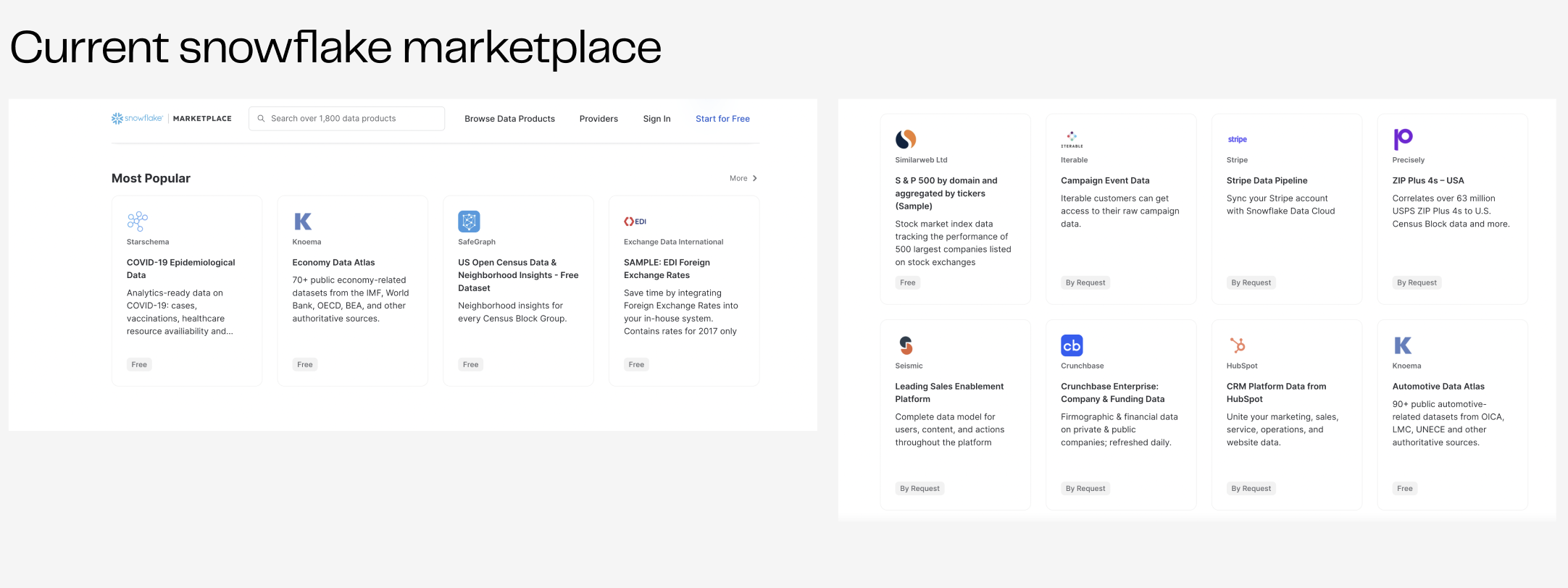
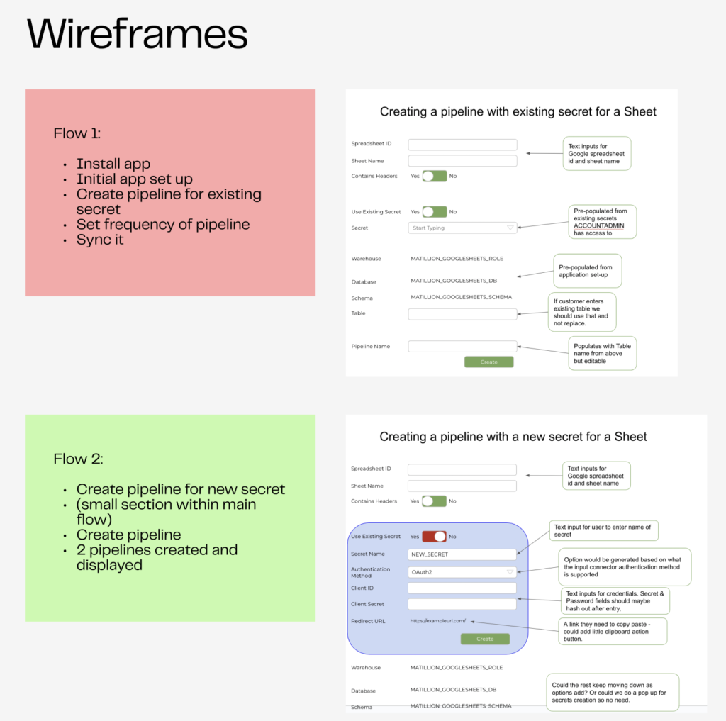
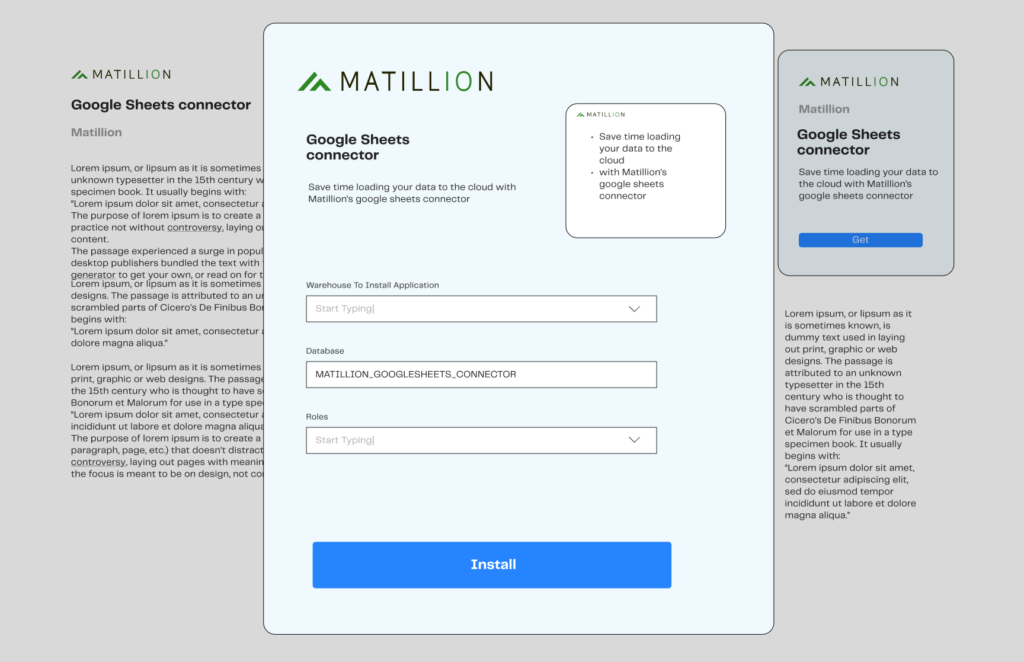
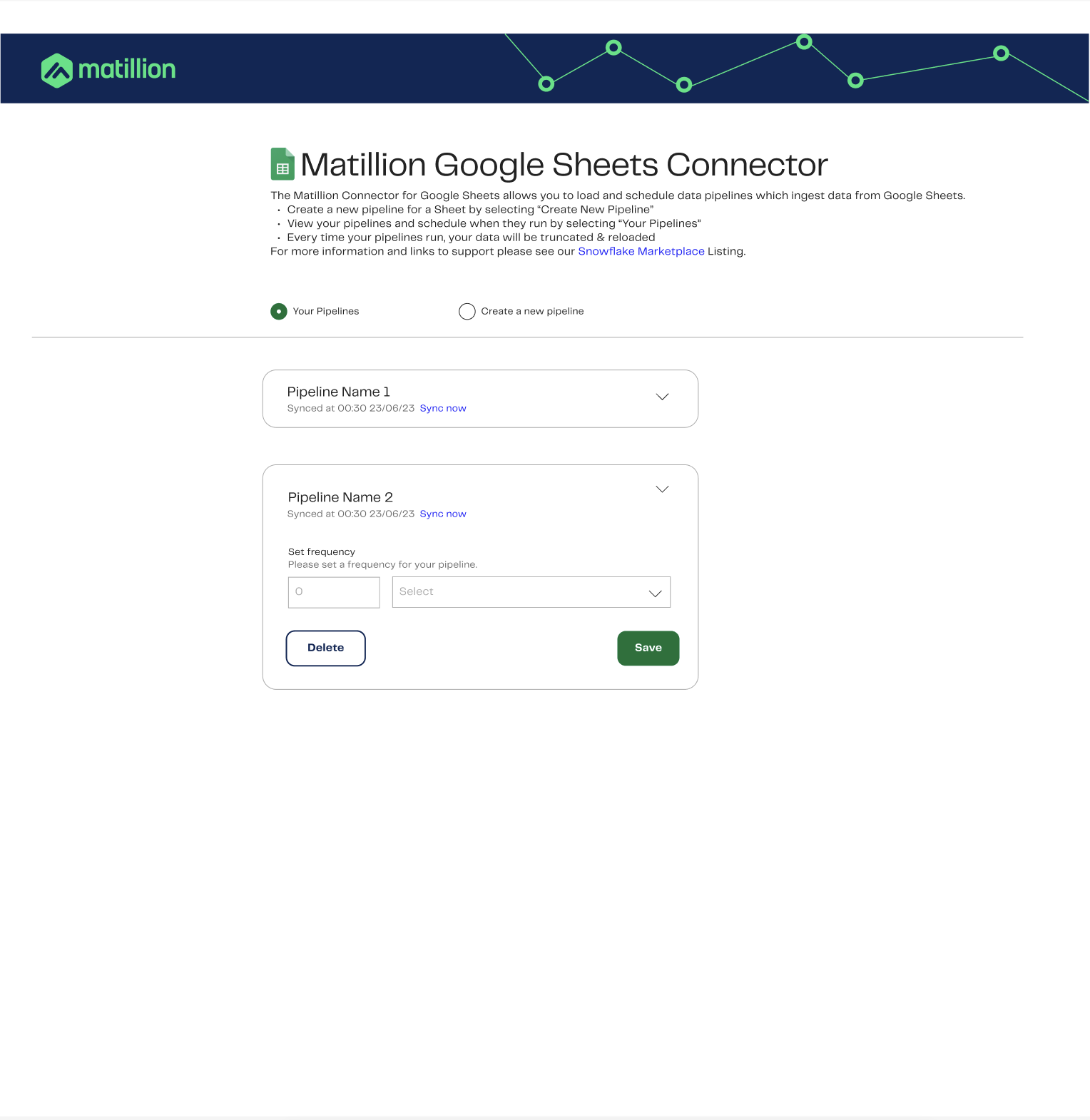
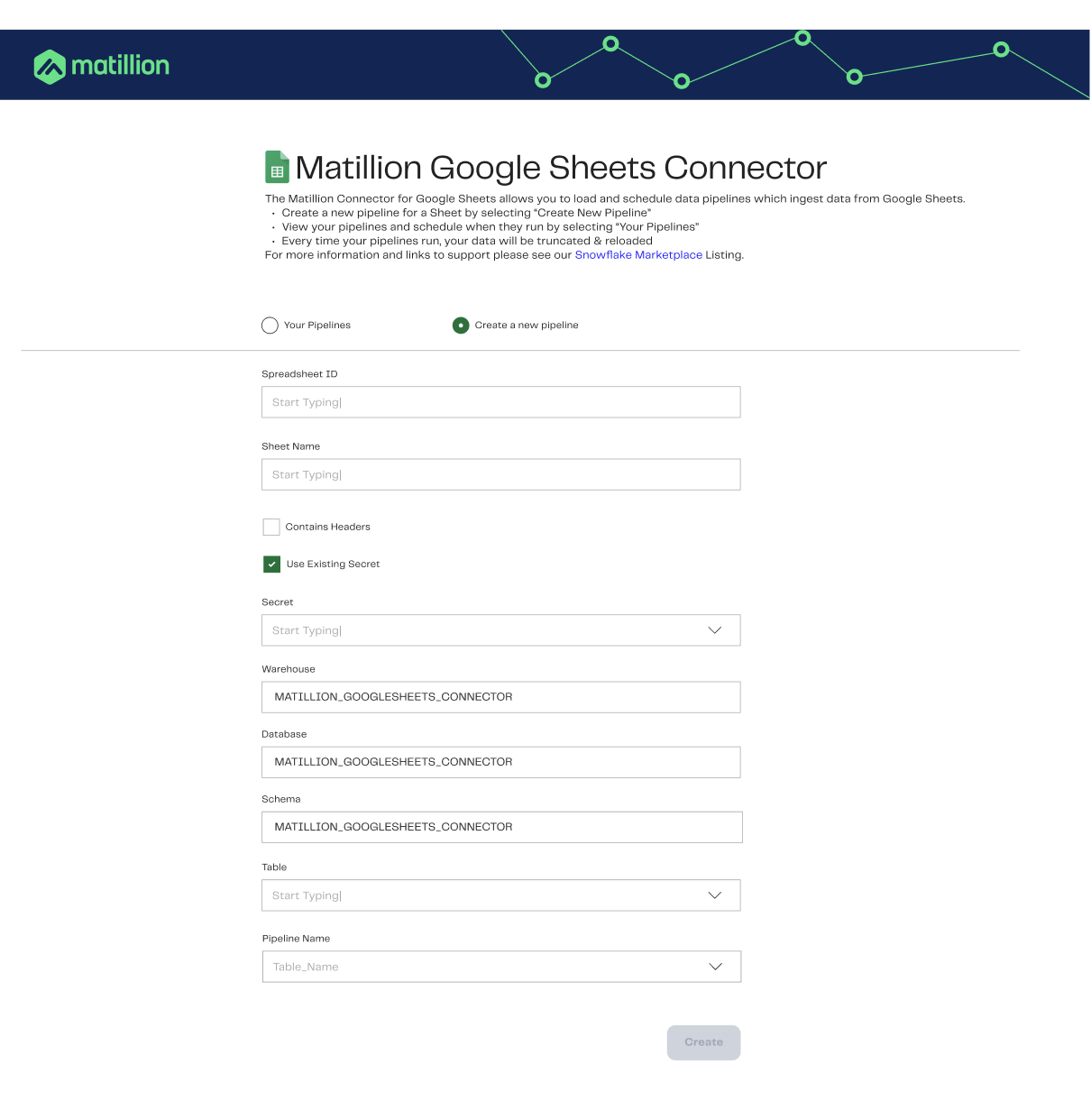
I designed the user interface for Matillion’s Snowflake Native App – a no-code pipeline creator that connects Google Sheets to Snowflake’s cloud warehouse. The design challenge lay in navigating strict backend limitations (Streamlit) and the requirement to build a fully functional, user-friendly experience within a single-page constraint.


Problem Statement

Due to Streamlit backend limitations on the Snowflake platform, we could only design within a single-page constraint, making standard interface patterns like tabs, modals, or toggles incompatible. This posed a significant challenge for presenting multiple flows such as pipeline creation and pipeline management clearly and intuitively.

To meet user expectations and align with brand experience, I had to design a layout that was both technically feasible and user-friendly, while also addressing accessibility, visual clarity, and brand consistency.

About the Project

The Snowflake Native App is Matillion’s integration tool hosted in the Snowflake Marketplace. It allows users to ingest and manage data through a Google Sheets connector, simplifying their data workflows within Snowflake’s cloud environment.

My role was to design the create pipeline section and the pipelines dashboard, delivering a seamless, intuitive experience for Snowflake users despite the platform’s strict limitations.

Design Goals

  • Design within a single-page constraint while still separating tasks and flows clearly

  • Ensure accessibility and brand alignment with Matillion’s recently updated brand guidelines

  • Simplify the interface for first-time users working with pipelines

  • Maintain usability despite technical limitations of Streamlit

  • Design scalable architecture for future improvements post-preview release

Research

Methods & Insights:

  • Analysed the end-to-end app flow, ensuring I understood the pipeline setup and dashboard logic

  • Explored the Snowflake Marketplace, researching design patterns and limitations in comparable apps

  • Identified usability risks caused by lack of native navigation or multi-page capability

“Apps in the Snowflake Marketplace often rely on basic Streamlit layouts creating a gap between technical functionality and polished UX.”

Ideation & Collaboration

“3 Amigos” Sessions:

I participated in design–engineering–product sessions (myself, a frontend engineer, and PO) to:

  • Understand the exact technical limitations imposed by Streamlit

  • Brainstorm feasible workarounds and design alternatives

  • Prioritise trade-offs between interaction patterns and backend support

Inspired Design:

  • Analysed similar Marketplace apps to identify creative interface patterns used within technical constraints

  • Used these references to fuel layout explorations and ensure our app felt modern and clean despite Streamlit’s minimal styling capabilities

Prototyping & Testing

Architecture:

  • I restructured the app to use radio buttons as navigation, enabling users to switch between the “Create Pipeline” and “Pipelines Dashboard” within the single-page view.

Interface Patterns:

  • Create Pipeline Section: Built around structured form fields with inline inputs

  • Pipelines Dashboard: Used an accordion to group pipeline entries and included a dropdown for scheduling frequency

Visual & Brand:

  • Applied Matillion’s updated brand colours and logo

  • Created a header graphic symbolising data connectivity

  • Addressed colour contrast to meet WCAG AA accessibility standards

Iteration:

  • Developed low-fidelity wireframes to iterate quickly

  • Shared prototypes with stakeholders for technical validation and feedback

  • Continuously refined layout, spacing, copy, and element structure

Final Solution

Final Features:

  • Radio button navigation for seamless switching between main app sections

  • Structured input form for creating new pipelines

  • Accordion layout for the dashboard with editable scheduling via dropdown

  • Accessible header image with contrast enhancements

  • Fully aligned with Matillion’s rebrand, ensuring consistency across products

Outcomes

  • Innovative UX within constraints: Delivered an intuitive UI despite limitations of the Streamlit backend

  • Improved user orientation: Radio buttons made it easier to switch between pipeline views and creation tasks

  • Accessibility Compliance: Achieved double-A contrast compliance through header design

  • Brand-consistent UI: Integrated new branding throughout the interface for a polished and consistent experience

  • Ready for private preview: Final design is included in the first private release in the Snowflake Marketplace

  • Scalable foundation: Future-proofed architecture for expanding the app as platform constraints ease

*Pipelines dashboard design*

*Create new pipeline section design*

Challenges & Learnings

Key Challenges:

  • Designing with Streamlit’s single-page limitation

  • Lack of traditional UI components like tabs or multi-page layouts

  • Maintaining clarity and usability without sacrificing backend compatibility

Learnings

  • Design constraints drive creativity, by understanding the technical system deeply, I was able to think flexibly and build usable alternatives

  • Collaboration with engineers early can often turn blockers into co-created solutions

  • Iterating with real context even on a low-fidelity level ensures alignment with development from day one

Reflection

This case taught me that powerful design doesn’t always require complex systems sometimes, it’s about doing more with less. Working under constraint forced me to simplify, prioritise, and think more creatively about interaction flow.

As the Snowflake platform evolves, I look forward to:

  • Expanding to a multi-page architecture with richer navigation

  • Adding onboarding guidance for first-time users

  • Introducing pipeline health indicators within the dashboard