Role: Website Designer & Developer Team: Individual project with collaboration from a lab assistant Tools: Figma, WordPress, Custom CSS, Integrated Forms (survey), Photography Timeline: 3 months Deliverables: New website with improved structure, branding, visuals, and UX Focus: Redesign for clarity, visual cohesion, and scientific accessibility
I led the complete redesign and development of the National Crystallography Service (NCS) website transforming an outdated, text-heavy interface into a cohesive, user-friendly experience. I focused on improving navigation, layout, and brand consistency while ensuring that complex scientific information remained accessible to a diverse academic and commercial audience.
Problem Statement
The NCS website suffered from poor usability and visual appeal due to an outdated interface and dense technical content. Key issues included:
An outdated colour scheme and inconsistent use of fonts
A lack of imagery to represent the lab’s work
Overwhelming blocks of text with lengthy case studies
A confusing navigation structure
No clear visual hierarchy or cohesion
These problems reduced user engagement and failed to reflect the modern, research-led nature of the service. My challenge was to redesign the site to make it accessible, visually appealing, and aligned with both scientific and user needs.
About the Project
The National Crystallography Service is a UK-based research facility offering single crystal X-ray diffraction services. Its main users include academics, researchers, and commercial partners from across the scientific community.
The website functions as both a service portal and an educational resource, so clarity, usability, and scientific integrity were all key requirements. The previous website failed to meet these goals.
Design Goals
Improve visual hierarchy and create a modern, consistent design
Replace heavy text blocks with engaging imagery and concise content
Improve navigation clarity to support both academic and commercial users
Align branding with NCS’s scientific reputation and identity
Ensure the site is easy to update and maintain independently
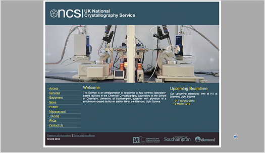
*Old NCS landing page*
Research
User Research & Stakeholder Insights:
Conducted a survey to understand the goals and behaviours of academic and industry users
Visited the lab environment to better understand crystallography processes and visualise key differentiators
Identified key stakeholder needs, including accurate content presentation and credibility for funding bodies
Analysed website traffic and user flow data to detect engagement drop-off points and performance issues
“The content is useful, but I just don’t know where to start or how to find what I need.” — user survey respondent
Ideation & Visual Exploration
Key Concepts:
Explore visual ways to communicate complex scientific processes, making them accessible to both experts and newcomers
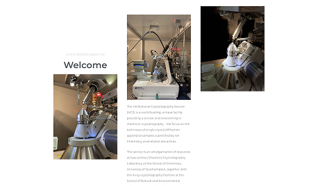
Use original lab photography to build visual interest and tell a story through the environment and tools
Select a new colour palette to modernise the look while staying aligned with the organisation’s logo
Restructure the homepage and key pages to prioritise usability and readibility
Photography helped capture the precision and clarity that crystallography represents and translated that essence into design.
Prototyping & Testing
Prototyping:
Developed wireframes to structure content flow, reduce overwhelm, and establish hierarchy
Created mock-ups to review layouts with the lab assistant and ensure scientific content was retained accurately
Iteration:
Incorporated feedback from lab stakeholders to balance visual design with subject matter accuracy
Iteratively refined content layout, font sizing, accessibility and page load performance
Detached the site from its original Southampton University domain, improving backend flexibility and identity
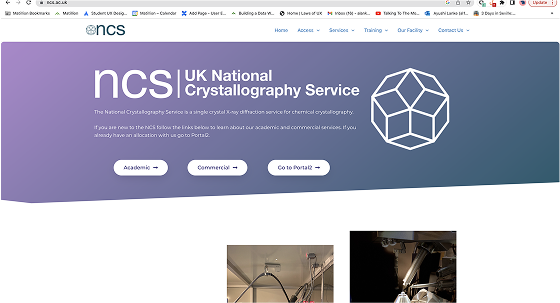
Final Solution
Design Features:
Cohesive colour palette aligned with the NCS brand
Original lab photography integrated into headers and key pages
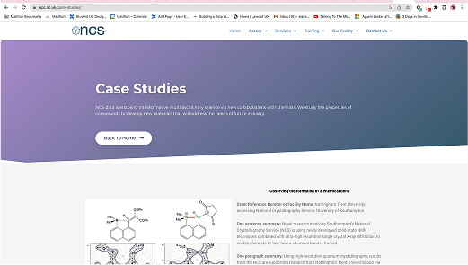
Simplified case study presentation, with clear headings and collapsible content
Streamlined navigation allowing users to find services, FAQs, and case studies efficiently
Consistent typography and layout system, improving readability and professionalism
Accessibility improvements, including clearer contrast ratios and structured page hierarchies
Outcomes
Increased user engagement, with stronger site interaction post-launch
Improved navigation reduced user confusion and drop-offs
Visual cohesion helped build trust and credibility with stakeholders
Website performance improved, supporting future research collaborations and outreach
80% positive feedback from internal stakeholders and external academic users
Previous image
Next image
Challenges & Learnings
Key Challenges:
Translating complex scientific content into digestible, web-friendly layouts
Designing for multiple user types (academic, commercial, internal)
Working independently with minimal resources but high expectations for visual polish
Learnings
Complex and detailed science can coexist beautifully with design when user needs and domain expertise are both respected
Designing for research institutions requires a careful balance between aesthetic appeal and technical accuracy
Understanding the subject matter firsthand (lab visits, discussions) helped create more informed and impactful design choices
Reflection
This project solidified my ability to balance creativity with scientific rigour, navigating both user needs and institutional constraints. By grounding the design in real-world lab observations and user insights, I delivered a solution that elevated the NCS’s digital presence and made their service more accessible to a wider audience.
Looking ahead, I would love to:
Build a mobile-first version to further improve accessibility
Add a case study search or filter function for easier navigation
Collaborate on digital storytelling for scientific education through interactive components