Role: Website Design, Development and Creation Intern
Team: Worked with a team of 20 stakeholders including therapists, coordinators and a marketing intern
Tools: Wix, Figma, Google Forms
Timeline: 3 months
Deliverables: New designed and developed website with improved navigation, accessibility, brand consistency and donation visibility
Focus: Accessibility, emotional design, and information clarity
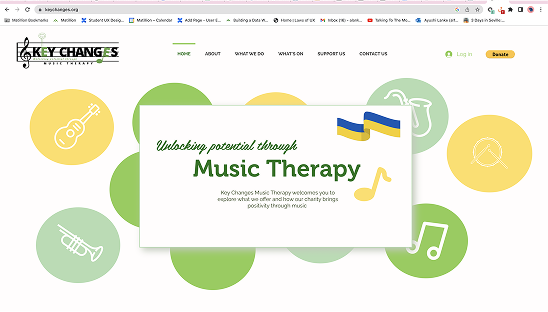
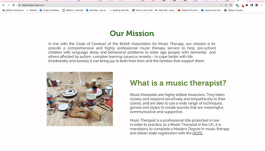
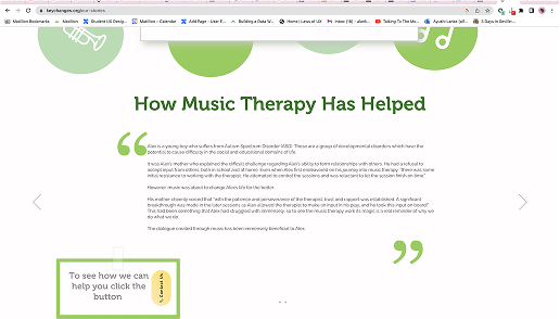
I redesigned and developed the website for Key Changes Music Therapy, a non-profit offering music-based therapeutic services. The goal was to modernise the site, improve accessibility, and elevate the charity’s online presence; ultimately making it easier for users to understand the services, engage with content, and support the mission through donations.
The previous website lacked both visual appeal and accessibility, making it difficult for users particularly families and individuals in need of support to understand what Key Changes offered. Specific issues included:
Inaccessible and inconsistent colour usage
Poor navigation structure and content discoverability
Inconsistent fonts and branding
Minimal use of visuals or infographics
Text-heavy layout that didn’t reflect the warmth or energy of music therapy
These challenges negatively impacted user engagement and did not reflect the professional, caring ethos of the organisation.
Key Changes Music Therapy is a charitable organisation that offers music-based therapeutic services to improve well-being for individuals of all ages. Their audience includes parents, families, and vulnerable individuals seeking support for physical, emotional and cognitive needs.
The goal of the website redesign was to:
Present Key Changes as a trustworthy, compassionate service
Make information easy to find for all users, including those less digitally literate
Increase donations and community engagement through a more accessible and emotionally resonant platform
Improve accessibility through consistent and readable colour and font choices
Create a visually cohesive and emotionally engaging interface
Structure navigation and content for clarity and ease of use
Respect user privacy while still incorporating visual storytelling
Highlight the charity’s mission and make donation pathways more prominent
*Old website landing page
Analysed the existing website to map user pain points and technical limitations
Benchmarked competitor sites, including other music therapy charities and health-based non-profits
Used user journey mapping to understand key interactions, such as locating services, learning about therapy outcomes, and making donations
“The site doesn’t feel warm enough it should show how music helps people feel better.” Stakeholder feedback
Worked with a marketing intern to rewrite and condense key content
Created a tone that reflected both professionalism and empathy, to suit the service’s sensitive nature
Explored visual alternatives to photographs (due to privacy constraints), using abstract shapes and iconography to suggest human connection and music therapy
Created wireframes to restructure the site’s layout for clarity and emotional resonance
Developed high-fidelity prototypes using a new colour scheme and consistent typography
Presented iterations to a group of 20 stakeholders for feedback, ensuring every voice was heard
Reviewed contrast ratios and font sizes to meet industry standard accessibility guidelines
Ensured navigability and readability for a broad range of users, including older audiences and vunerable customers
Unified colour scheme with warm, calming tones and accessible contrast
Clear navigation system, with simplified headings and consistent information flow
Infographic-style visuals and iconography to communicate complex ideas without breaching privacy
Emotionally relevant imagery and consistent branding to build trust
Donation call-to-actions placed clearly throughout the site to support fundraising goals
Improved accessibility through consistent colours, font sizes, and contrast
Stronger engagement from users through clearer layout and warmer visuals
Navigation redesign allowed users to find services and contact information more quickly
The site now feels visually aligned with the mission and communicates its purpose more effectively
Design changes supported growth in digital engagement, helping to build trust and drive donation interest
Addressing privacy concerns while still creating a compelling visual story
Navigating the technical limitations of the Wix platform
Managing and synthesising feedback from 20 diverse stakeholders with varying digital experience
Synchronising content between the website and social media channels
Designing for non-profits requires deep empathy and emotional sensitivity every element must align with both mission and user context
Constraints like platform limitations or privacy issues can fuel creative, impactful alternatives
Managing diverse feedback is a skill in itself prioritising, validating, and integrating ideas into a coherent design is critical
This project reinforced the importance of human-centred design, especially in emotionally charged domains like healthcare and therapy. I learned how to apply accessibility, empathy, and narrative into a site that not only functions well, but feels deeply aligned with its users.
Looking ahead, I would explore:
Implementing a real-time chatbot or messaging system for quicker support
Introducing case studies with anonymised testimonials to bring the therapy impact to life
Enhancing mobile responsiveness further for users accessing the site on-the-go