Explore my portfolio

Custom connector paging strategy

Overview

Summary

Role: Product Designer

Team: Cross-functional (Product Owners, Product Managers, Engineers)
Tools: Figma, Jira, Miro
Output: High-fidelity interface, interactive prototype, developer-ready assets
Methods: User feedback analysis, competitor benchmarking, iterative prototyping
Result: Improved comprehension, reduced misconfigurations, and increased confidence for technical users

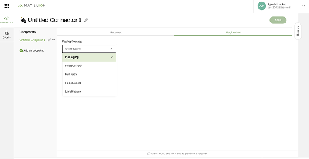
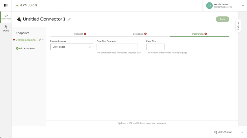
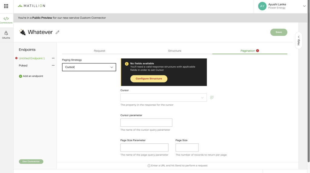
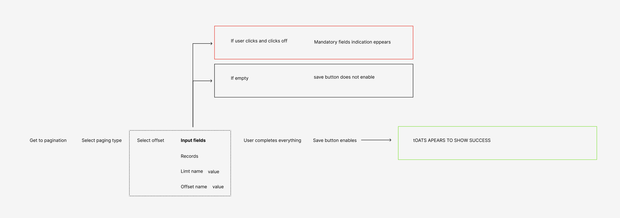
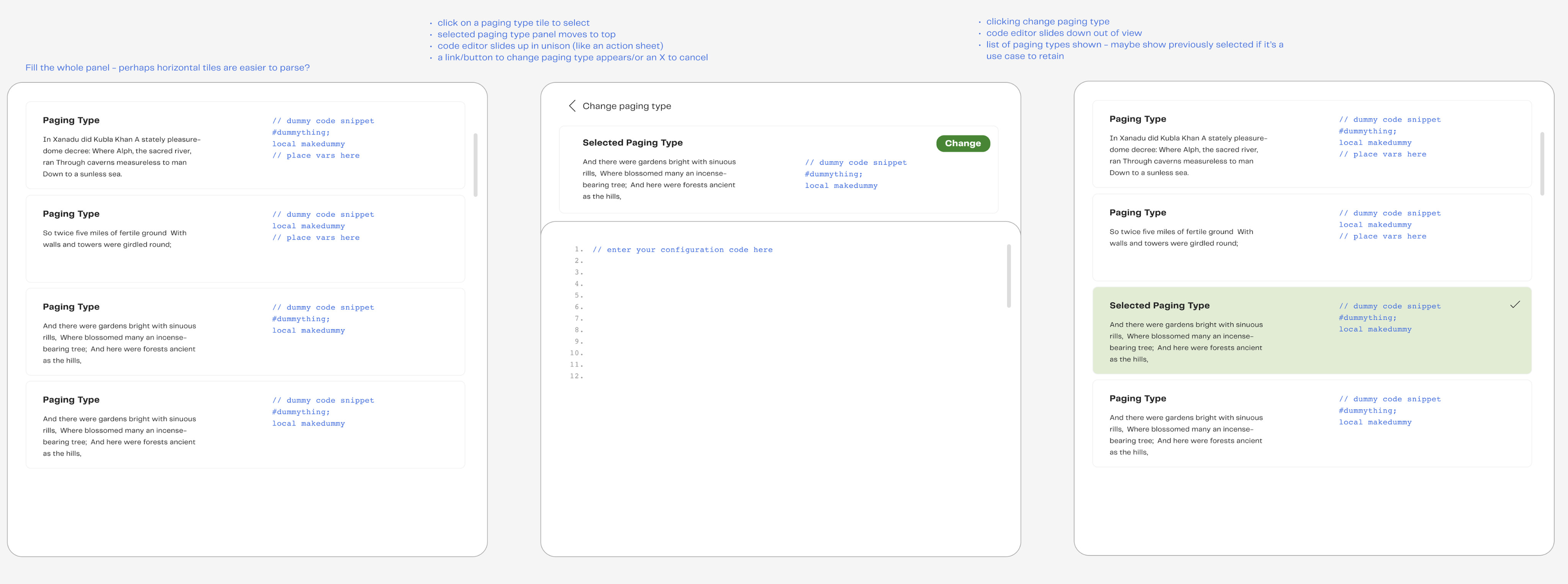
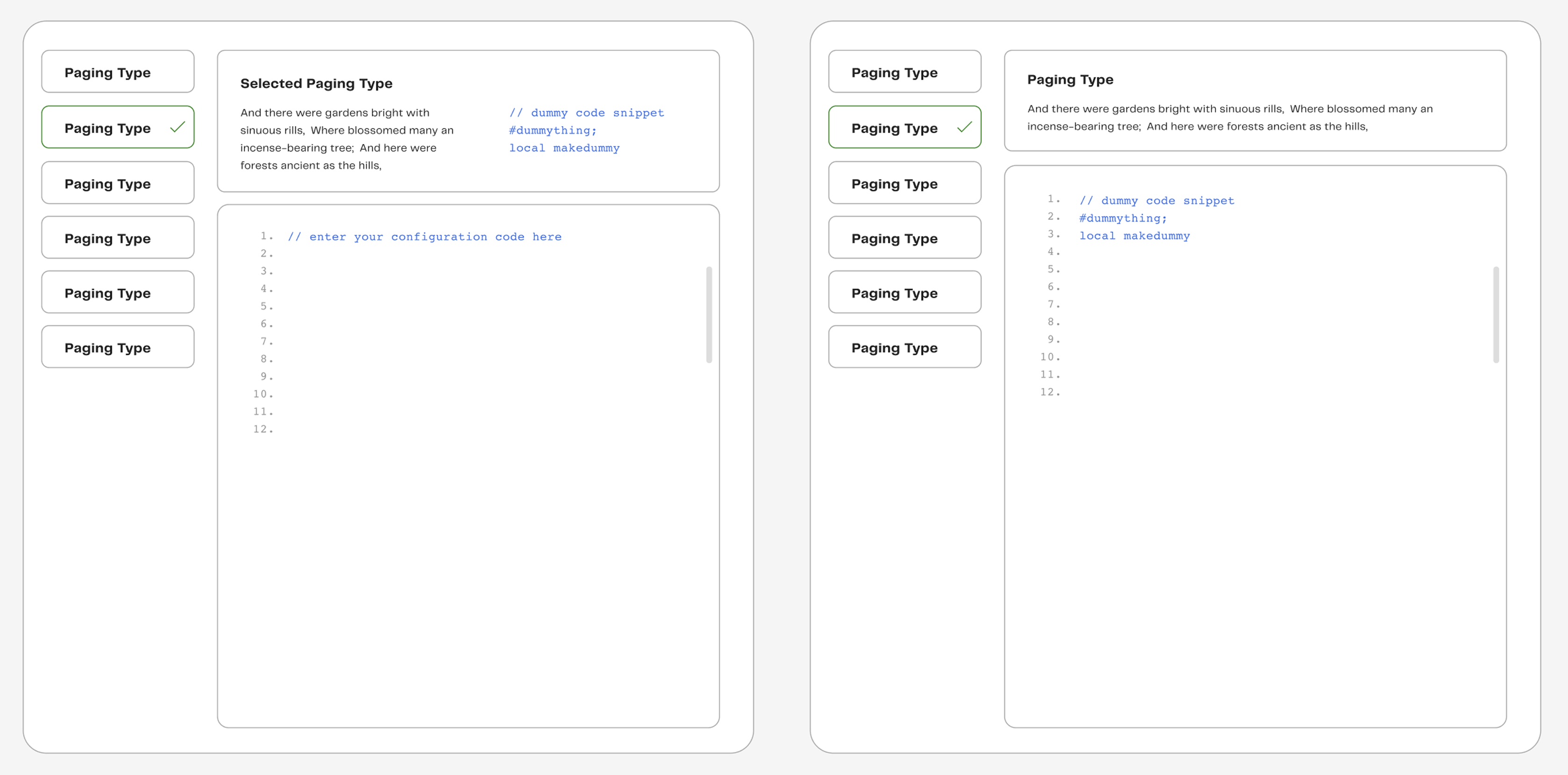
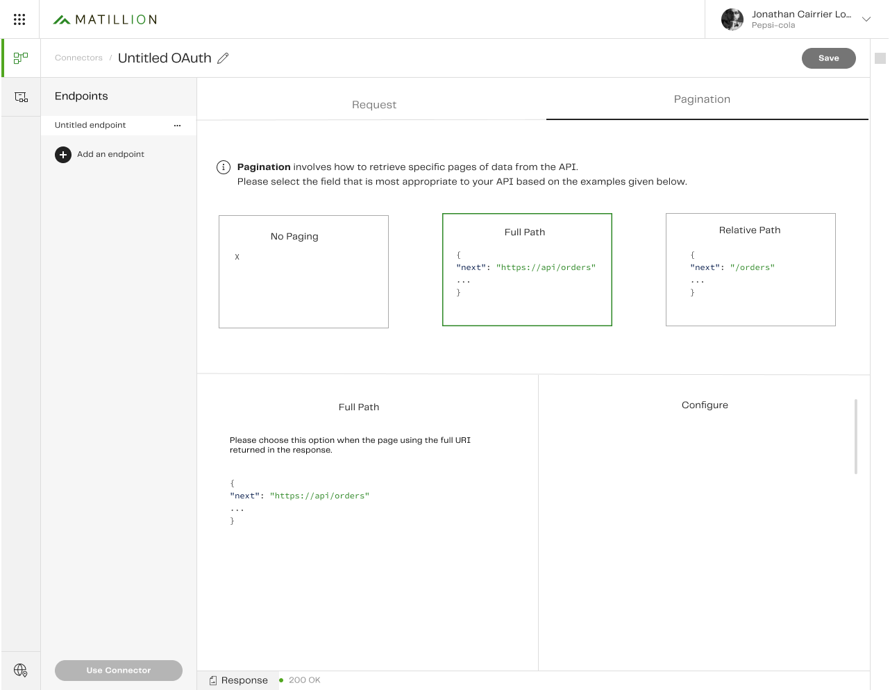
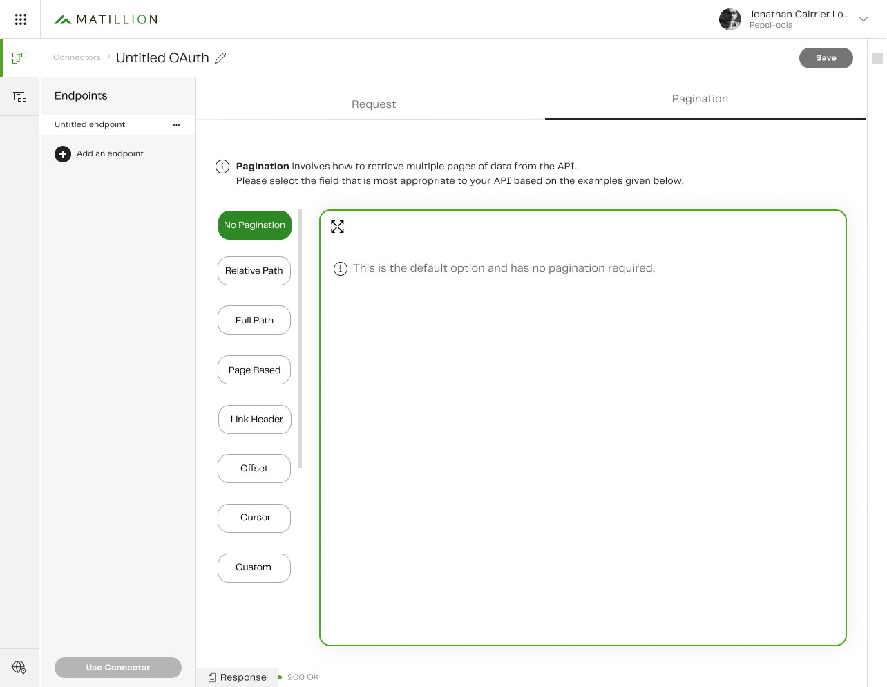
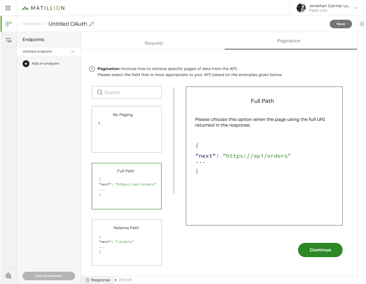
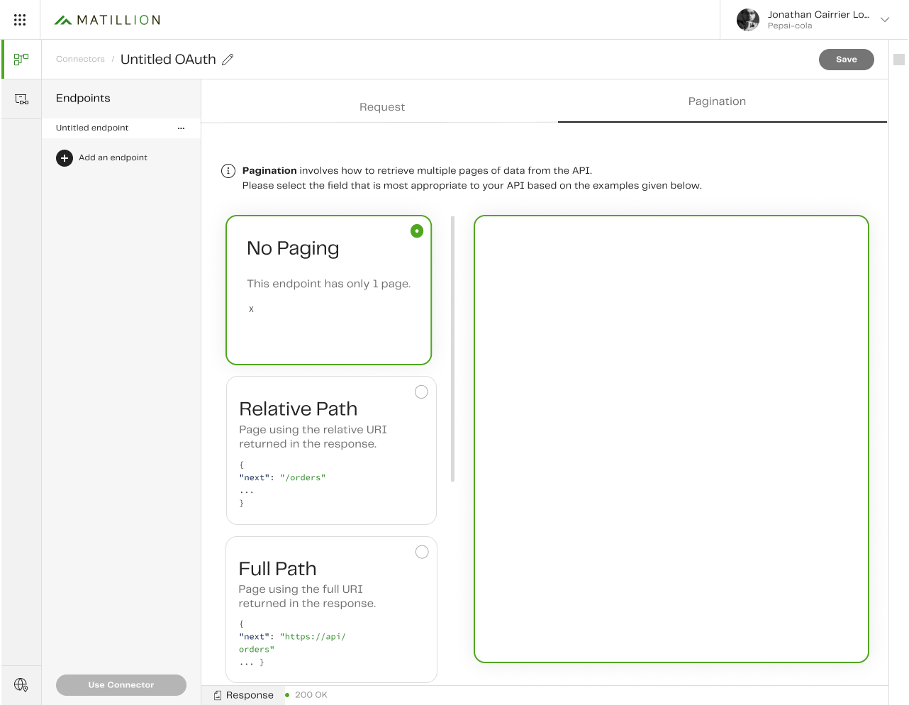
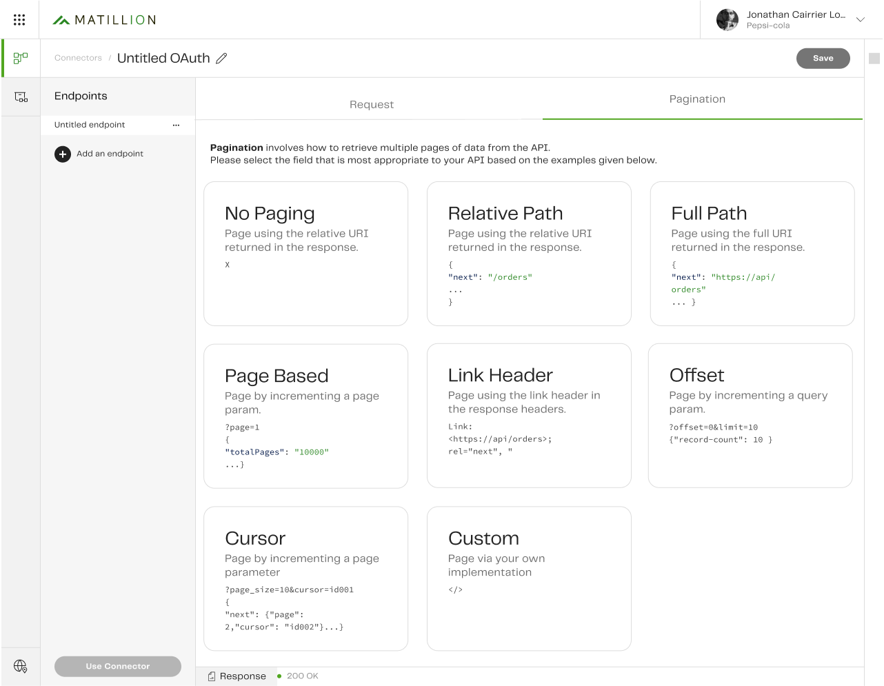
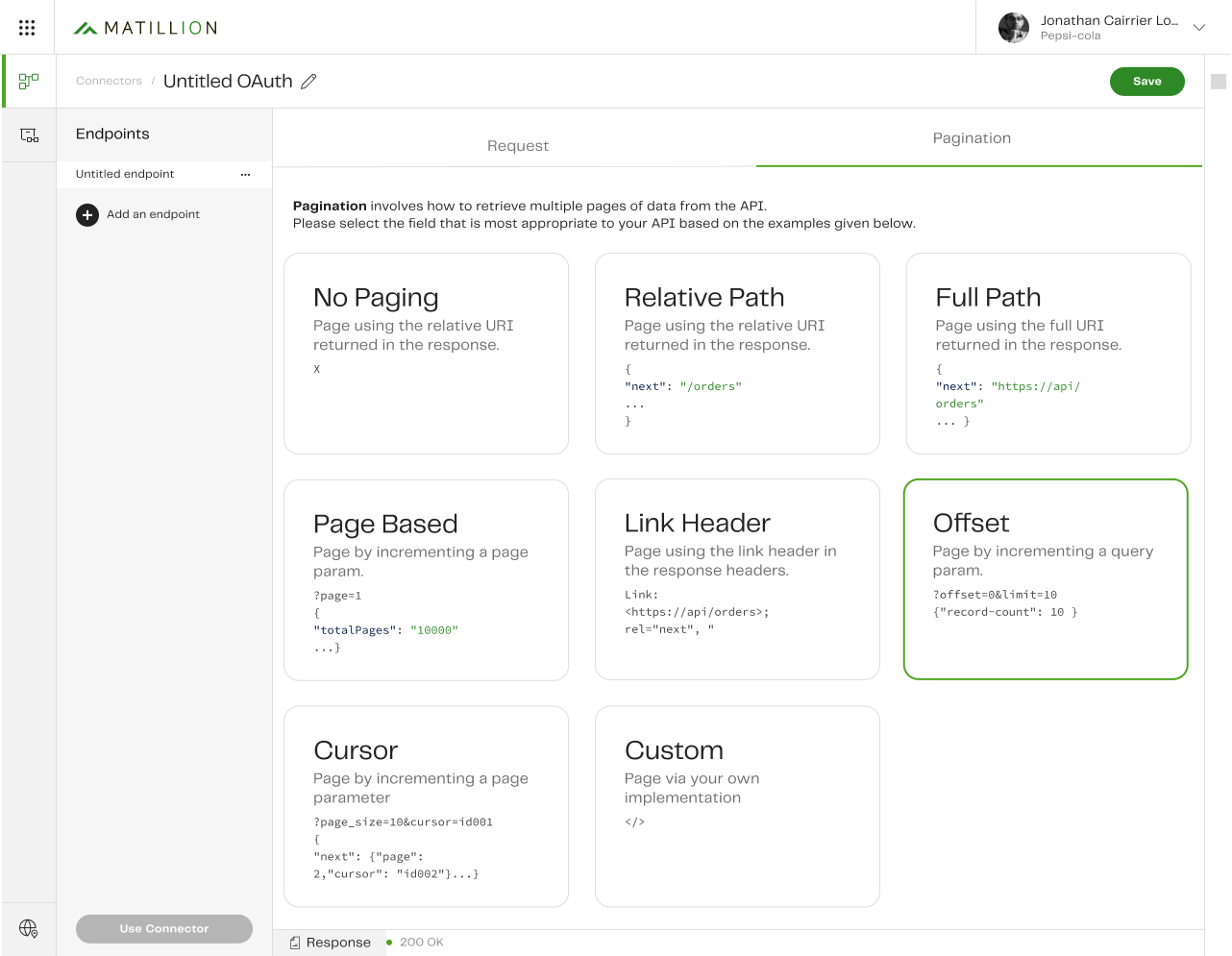
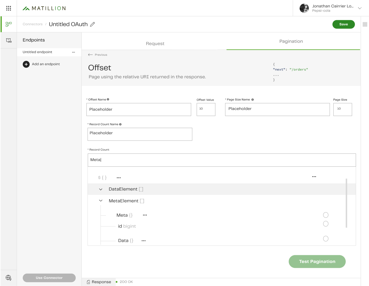
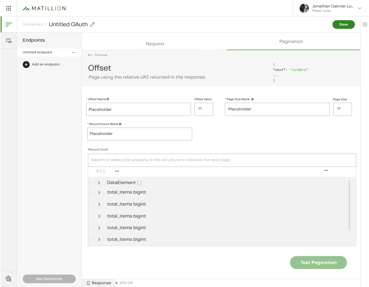
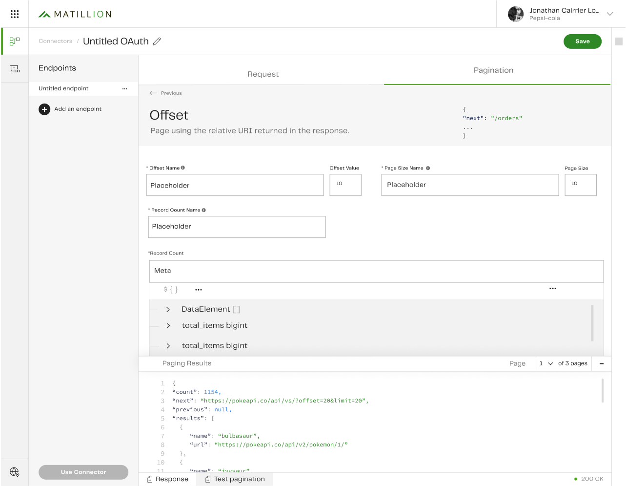
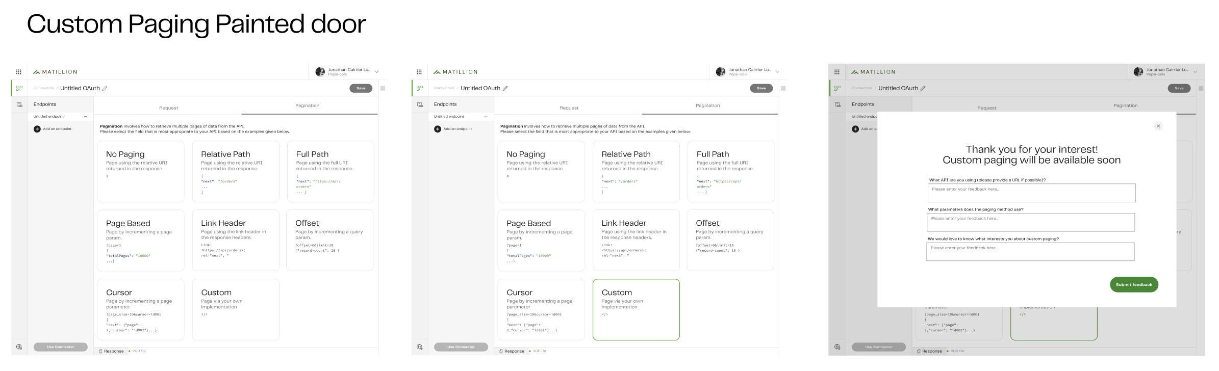
I redesigned the pagination strategy interface in Matillion’s Custom Connector, a no-code builder for API connections, by introducing visual comparisons, inline configuration, and a real-time preview. This helped users overcome confusion caused by technical jargon, complex inputs, and inconsistent layouts.

Problem Statement

Internal and external users of Matillion’s Custom Connector were struggling to configure pagination effectively. The existing experience included:
  • Dropdowns filled with unfamiliar technical terms

  • Inconsistent and unclear form fields

  • No way to preview or understand what each strategy actually did

As a result, users lacked confidence, often selected incorrect options, and raised support tickets when configurations failed. This created friction for developers and delayed successful connector creation.

About the Project

The Custom Connector is a no-code feature that enables users to create data connectors for APIs not natively supported by Matillion.

The primary users are ETL Developers and Data Engineers who need to retrieve data from APIs that use different pagination methods (e.g. offset, cursor, next page tokens).

The existing pagination configuration UI made this process difficult and error-prone. My goal was to create a more intuitive, educational, and usable interface.

Design Goals

  • Reduce user friction when selecting and configuring pagination strategies

  • Improve comprehension by replacing jargon with clearer language and visual aids

  • Enable strategy comparison upfront to help users make informed choices

  • Create a reusable and consistent design pattern for future API-related features

*Old paging selection page 

*Old paging configuration page

*Old paging configuration page + error toast messaging 

Research

Methods:

  • Analysed user feedback to identify recurring pain points
  • Reviewed support tickets to understand common configuration issues
  • Conducted competitor analysis across 4 industry tools
  • Shadowed engineers to understand the technical logic behind each paging method

Insights:

  • Many users were unfamiliar with pagination terms like ‘offset’ or ‘cursor’
  • Dropdown-only formats made selection feel like guesswork
  • Users needed both explanations and live context to configure with confidence

Ideation & Design

Early Collaboration:

  • Partnered with engineers to explore feasible ways to simplify complexity

  • Identified a pattern: most confusion stemmed from not knowing how each strategy worked in practice

Key Design Decisions:

  • Introduced an eight-tile layout, each tile representing a pagination strategy

  • Included code snippet previews on each tile for visual understanding

  • Enabled inline configuration once a strategy is selected

  • Designed a preview feature to show users how their selected setup would behave using live API data

  • Prioritised usability principles such as reducing clicks and following Nielsen Norman heuristics

Prototyping & Testing

Prototyping:

  • Created low- and high-fidelity designs in Figma for iterative testing

  • Focused on hierarchy, visual grouping, and copy clarity

Iteration:

  • Incorporated feedback from the design team, engineers, PMs, and POs

  • Refined the interface through multiple cycles, improving visual layout, content clarity, and interaction flow

  • Ensured readiness for development handoff by aligning with design systems and dev needs

Final Solution

Final Features:

  • Eight visual tiles allow users to compare strategies side-by-side

  • Each tile includes a short description and code snippet for context

  • Selecting a tile opens inline configuration, reducing clicks and streamlining the flow

  • A preview mode lets users test their setup by retrieving 2–3 API pages

  • Introduced a Painted Door Experiment to test interest in custom paging options

Outcomes

  • User comprehension improved: users felt more confident choosing a strategy

  • Fewer clicks were required to complete the setup, increasing flow efficiency

  • Visual previews helped validate setups, reducing reliance on trial and error

  • Painted Door Experiment gathered real user data for future customisation features

  • Design consistency improved, creating a scalable solution for similar API configurations

Challenges & Learnings

Key Challenges:

  • Navigating the technical complexity of multiple pagination formats

  • Creating visual clarity while respecting existing backend limitations

  • Balancing contrasting feedback between simplifying for users and satisfying developer flexibility

Learnings

  • User confidence comes from context and control—clear language and visual examples matter deeply when designing for technical workflows

  • Collaborating early with engineering ensures design feasibility and speeds up development alignment

  • A modular UI design with consistent interaction patterns supports both scalability and usability

Reflection

This project taught me the value of designing for clarity in complexity. Even highly technical features can become intuitive when user needs, visual cues, and interaction flows are carefully aligned.

If extended, I would explore:

  • A guided onboarding walkthrough for first-time users

  • Preset strategies based on detected API structures

  • Progressive disclosure for advanced options